15 Stakeholder Diagrams To Add To Your Toolkit
Stakeholder diagrams, frameworks, and models can be useful tools for analyzing and grouping your stakeholders.
They can allow you to present complex information in your stakeholder plan, in a visual way that’s quick to understand and easy for others to digest. But some of them are more practical than others — and many of them are only ideal for one or two specific purposes.
So, we wanted to share with you 15 of the most popular stakeholder diagrams, how they’re used, and whether they’re worth adding to your toolkit.
Jump ahead to the diagram that you’re most interested in, or scroll through the full list.
Power-Interest Grid
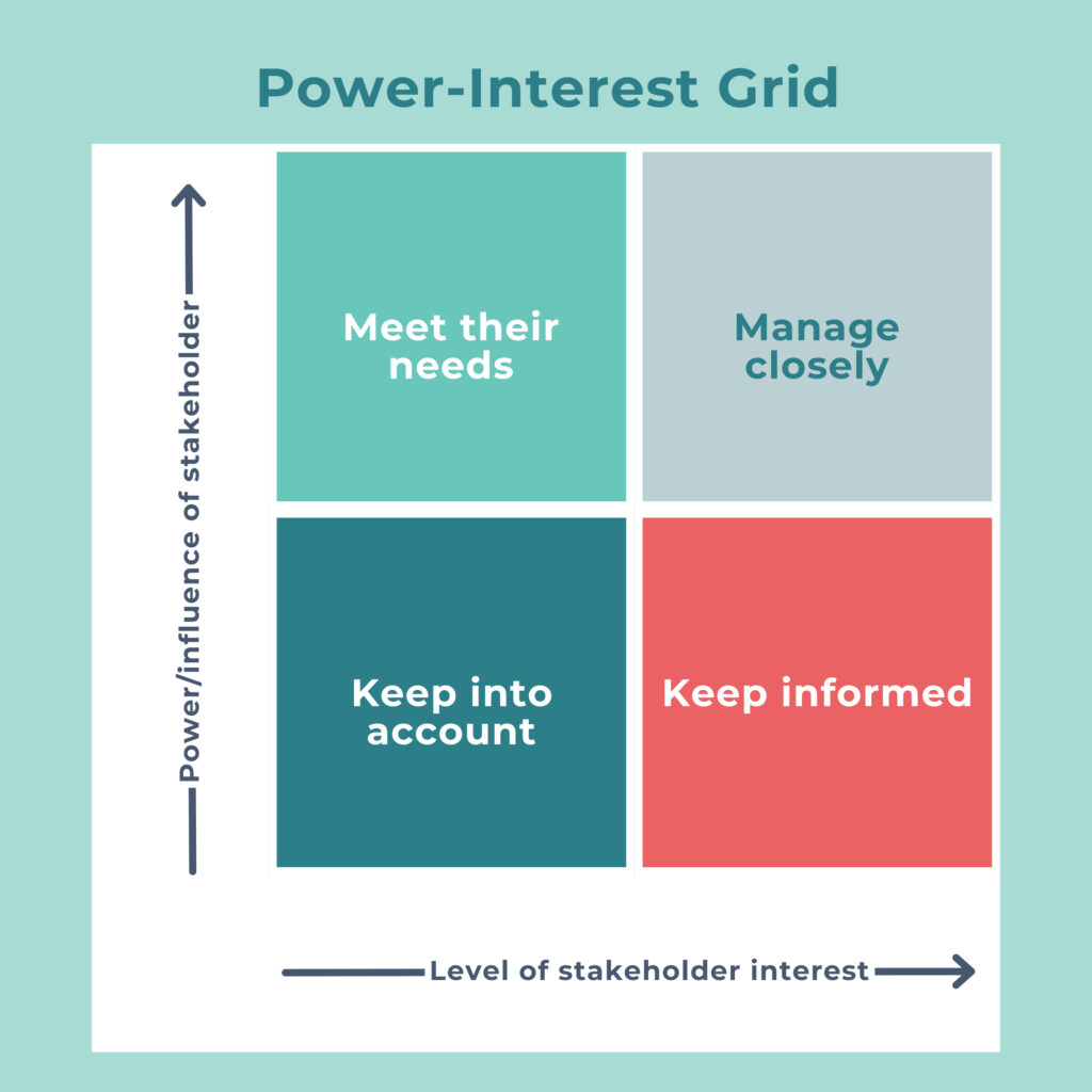
The Power-Interest Grid, also known as the Mendelow Stakeholder Matrix, is used to plot a location for each stakeholder, based on their levels of power (or influence) and interest. Each quadrant suggests how you should treat or engage with stakeholders, such as meet their needs, manage closely, keep informed, and keep into account.
Of course, this model does lack a lot of context, such as whether a stakeholder is for/against the project. And power can be difficult to define, since anyone can potentially influence your project (thanks to today’s new media). It also doesn’t list out what the stakeholder interests are.
Power-Predictability Matrix
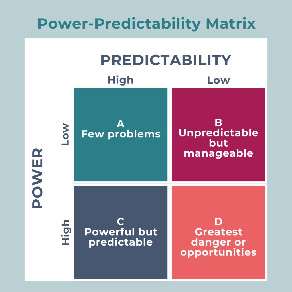
Like the previous model, the Power-Predictability Matrix plots stakeholders on a grid — this time based on their level of power and predictability. Depending on which quadrant they end up in, it suggests what you might expect from stakeholders (and therefore how you might manage them) — few problems, unpredictable but manageable, powerful but predictable, and greatest danger or opportunities.
This stakeholder diagram also has some limitations and issues — can you really predict human behavior? And is it acceptable to talk about humans in the terms used here, positioning them as problems you need to manage? Perhaps not.
A Note on Power in Stakeholder Diagrams
You’ll see we’ve covered a few popular stakeholder diagrams here that incorporate power. Power used to be a lot easier to predict back when these models were coined. These days, power is much less hierarchical than it used to be, with technology and social media making it possible for everyday people to influence and communicate with others (even large groups of people). So, if you do choose to use these power-focused stakeholder diagrams, make sure you also analyze your stakeholders using other methods, too.
Salience Model
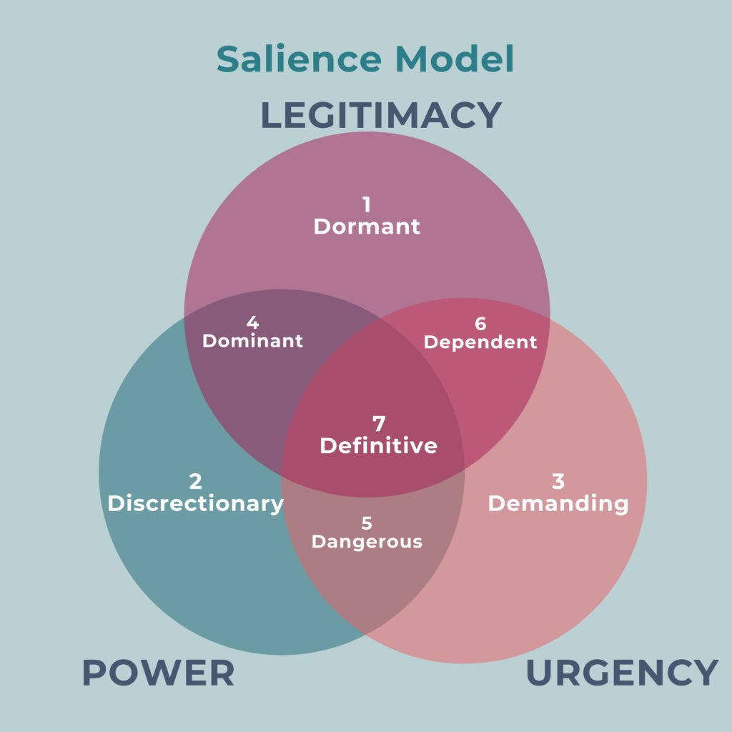
The Salience Model is a venn diagram with three overlapping circles, producing 7 distinct categories that you can use to classify stakeholders and set priorities:
| Group | Attributes | Priority |
| 1. Dormant | High power, low legitimacy, and low urgency | Priority 3
With just one salient attribute, these stakeholders often require the least amount of attention, but should be monitored in case their situation changes. |
| 2. Discretionary | High legitimacy, low power, and low urgency | |
| 3. Demanding | High urgency, low power, and low legitimacy | |
| 4. Dominant | High power, high legitimacy, and low urgency | Priority 2
With two salient attributes, these stakeholders will benefit from regular communication and engagement to ensure the project stays on track. |
| 5. Dangerous | High power, high urgency, and low legitimacy | |
| 6. Dependant | High urgency, high legitimacy, and low power | |
| 7. Definitive | High power, high legitimacy, and high urgency | Priority 1
As these stakeholders have all attributes, they are your core stakeholder group. Their involvement and communication should be prioritized. |
This model, like the others, is useful for some things — you might be able to quickly identify priority stakeholders. But it is also an oversimplification and lacks other attributes, the option for ‘neutral’ salience, and the importance of continually reassessing as the projects go on (because power, legitimacy, and urgency can shift continually).
A Note on Outdated Language
The above model (and several others here) do contain some words and phrases that aren’t typically used today because they would be considered offensive. Is it a good idea to refer to stakeholders as demanding? dominant? dangerous? or dependent? Probably not. If you do choose to include a stakeholder diagram that uses this kind of language, it might be a good idea to add a note that you don’t necessarily agree with the labels used.
Stakeholder Knowledge Base Diagram
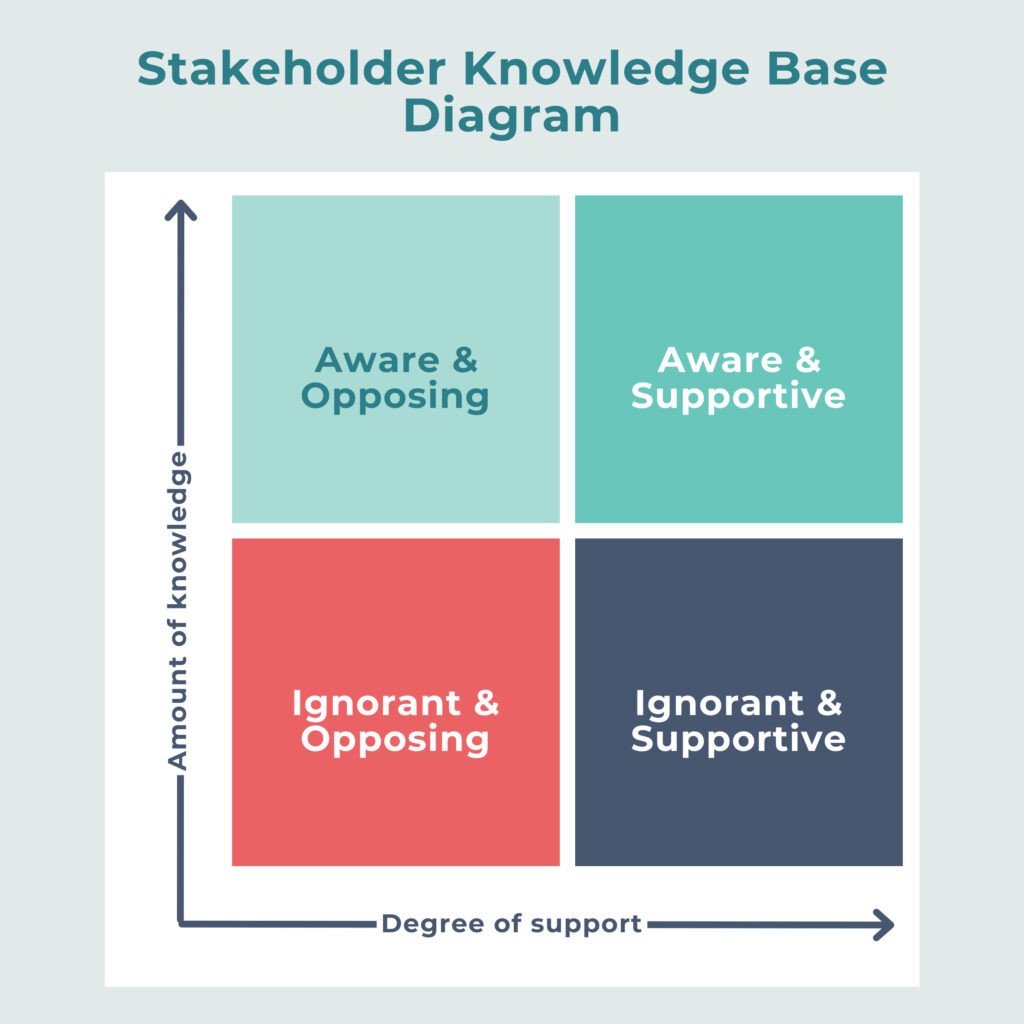
Similar to the other matrix stakeholder diagrams here, the Stakeholder Knowledge Base Chart plots your stakeholders on one of four quadrants. In this case, their location will depend on the stakeholders’ amount of knowledge about the project and how much they support it — and this will determine how you communicate and engage with stakeholders:
- Stakeholders with high awareness and high opposition may be considered a risk and require more management.
- Stakeholders with high awareness and high support should be kept informed so they continue to support you.
- Stakeholders with low awareness and high opposition should be provided with information to help change their attitude.
- Stakeholders with low awareness and high support should be kept engaged to continue strengthening their support.
Like some previous models, this stakeholder diagram uses some unfortunate word choices — it might not be the best idea to call someone ‘ignorant’. It also lacks other attributes that are important for stakeholder analysis and oversimplifies stakeholder attitudes.
A Note on Changing Stakeholder Expectations
Some stakeholder models will be based on older approaches where some stakeholders may not have expected to be informed about a project — or be able to have a say in it. These days, more stakeholders expect to have a greater say than they used to. Even those that aren’t directly or significantly impacted.
Influence/Interest/Impact Mapping
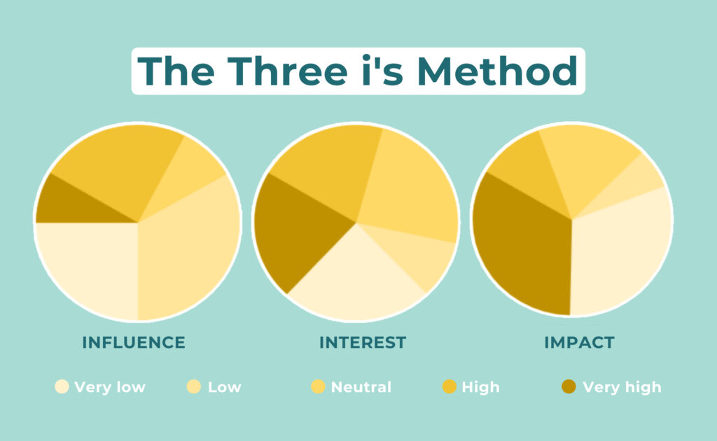
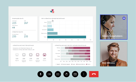
One of our favorite stakeholder diagrams is the Influence/Interest/Impact model — or, the Three i’s Method of stakeholder mapping. We came up with this model in order to plot in a multi-dimensional way and support contact group segmenting (also, it is built into our Simply Stakeholders product!). The idea is that each stakeholder gets a value for each attribute, with a spectrum from very low to very high, allowing you to visualize the attributes on pie graphs (like above), scatter plots, or stacked bar graphs.
If you’re already a Simply Stakeholders user, you’ll see that you can also filter by engagement, sentiment, and contact groups based on the Three i’s, which is handy for checking who you should prioritize next in your engagement, any gaps you need to fill, and how well your engagement is going. Inside the tool, updating your stakeholder diagrams is easy because they’re linked to your contact records (which you should be updating regularly).
Spreadsheets
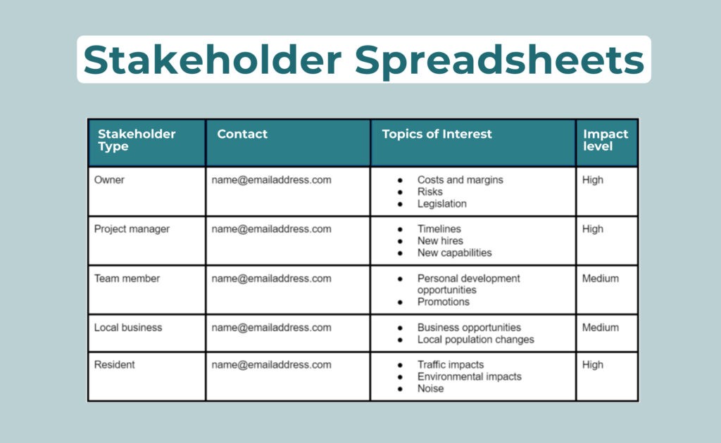
We’re not usually that big on using spreadsheets to manage stakeholders, but in some cases, they can be a practical diagram for stakeholder analysis and management. You could use a spreadsheet or table to list out a variety of details, such as demographics, interests, contact info, and other word-heavy information. In that respect, the flexibility of spreadsheets can be quite handy and very accessible — everyone has access to Excel or Google sheets, or even tables in Google docs or Word. But unlike other types of stakeholder diagrams, spreadsheets are not very visual, so it can take some time to interpret the data.
You might also be tempted to use a spreadsheet for managing stakeholders, but we generally don’t recommend that. Read more here: 4 Reasons Why You Should Leave The Spreadsheets Behind.
Stakeholder Relationship Network Diagram
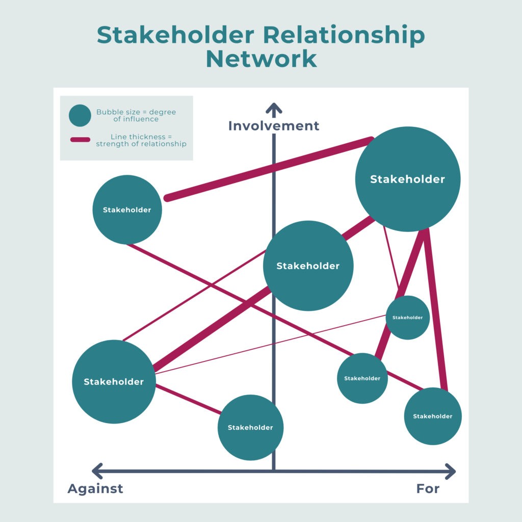
Stakeholder relationship network mapping is a practical (but sometimes complex) stakeholder diagram that’s worth adding to your toolkit. In essence, it can look a bit like a mindmap, flowchart, or network map that shows your stakeholders and their relationships with one another. You can also include or overlay other relevant attributes, such as their level of involvement in the project and whether they are for or against it (as you can see in the example above). By changing the size of the stakeholders, the shapes used, the weight of the connections, and the colors, you include even more information than that — all digestible at a glance.
If you need to understand the relationships between stakeholders, this can be a great diagram to use. However, it can be a tricky kind of diagram to produce, as many mindmapping tools are quite simple — and the more complex or customizable ones can be fiddly to create and update. The only practical option for larger organizations that need to map a lot of relationships and complex connections is a purpose-built relationship mapping tool.
Fortunately, relationship mapping tools are now available inside Simply Stakeholders (linked with your contact records for easy updates!) — with more capabilities coming to the product soon.
SWOT Analysis
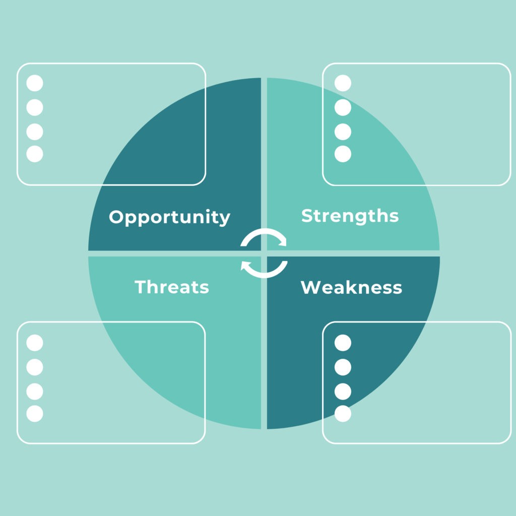
You’ve probably heard of a SWOT analysis before — and maybe even used this type of diagram… but have you applied it to your stakeholder planning or engagement project? Sometimes it can be a useful tool for identifying gaps in what you’re doing and strategic ways to approach your work that you hadn’t already considered. So, spend a few minutes plotting out the strengths, weaknesses, threats, and opportunities that relate to your stakeholder management, engagement, or consultation project — and incorporate this diagram into your planning process.
SMART Goal Setting
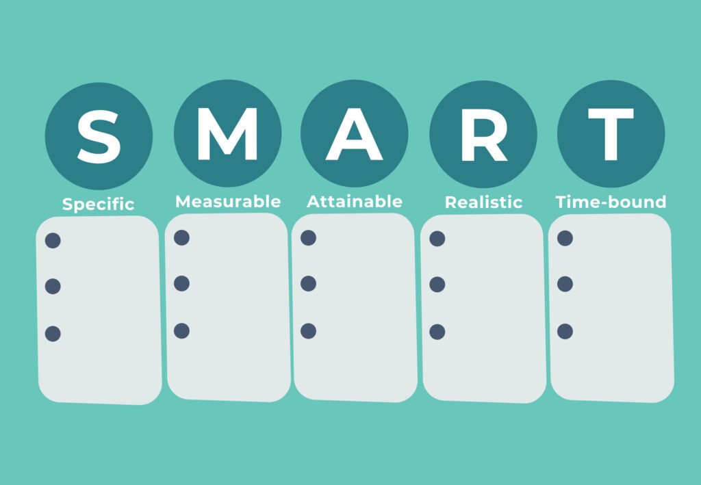
Again, this diagram isn’t necessarily associated with stakeholder engagement, but it’s a good all-rounder that can be valuable when creating your initial objectives and stakeholder plan. Write out your goals in a way that fits the S.M.A.R.T. guidelines to get crystal clear about what you want to achieve from managing or engaging with stakeholders.
GANTT Charts
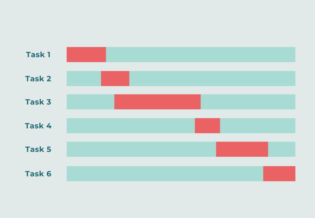
This is another diagram that’s commonly used in project planning, but is also very practical for stakeholder engagement or consultation projects. Consider including a GANTT chart with your stakeholder plan to outline what actions or engagement activities you will take — and when you expect to start and finish them.
Stakeholder Geomapping
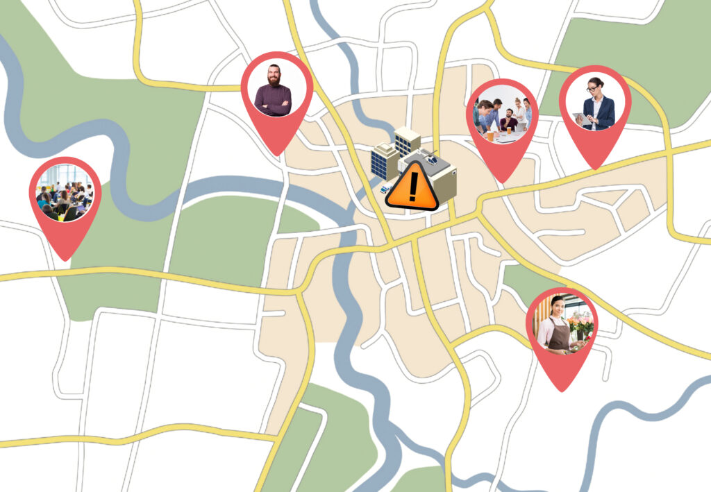
Geographically mapping stakeholders involves plotting the location of your stakeholders and stakeholder groups on a map. You might include other important landmarks, such as the location of your organization or project. This kind of stakeholder diagram can help you quickly see who might be more impacted by noise, traffic, disruptions, and other aspects of the project — and therefore, what kind of engagement and communication they may require.
Stakeholder Onion Diagram
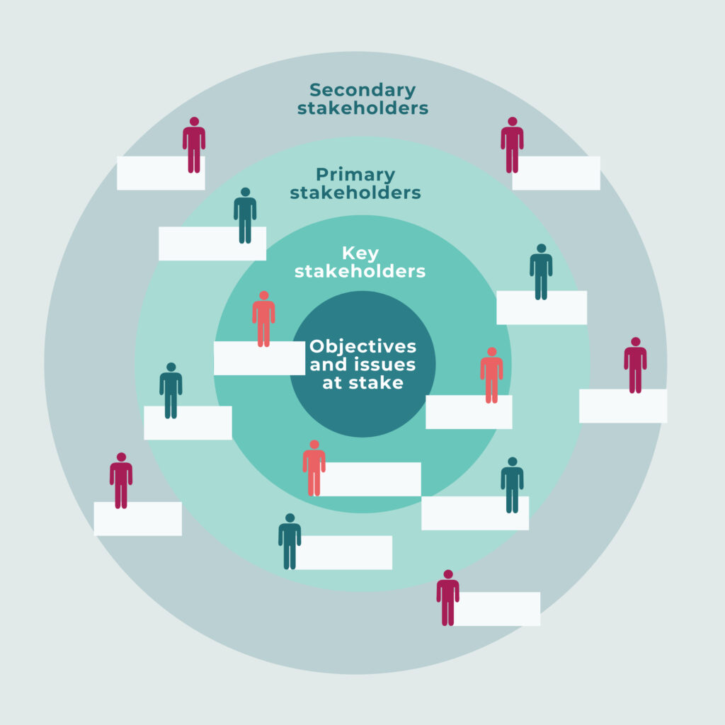
The Stakeholder Onion Diagram shows your stakeholders on a chart, with the inner circle consisting of your key stakeholders who are closest to your objectives and issues. The next circle outward is considered to be primary stakeholders, and your outer circle shows secondary stakeholders. In addition, you may choose to include other data within this diagram, such as connected arrows to show relationships, different colors to show other attribute variations, or even splits to show different categories of stakeholders at each level (e.g. government, internal, external, financial, etc.).
Stakeholder Rainbow Diagram
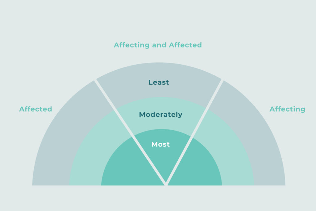
The Stakeholder Rainbow Diagram is used to classify stakeholders based on how you expect them to affect (or be affected by) the project. The stakeholders closer to the middle of your rainbow are likely to experience the most impact (and exert the most influence) on your project. The stakeholders in the outer parts of your rainbow are likely to be less impacted and/or less influential.
You can see an example of what the Rainbow Diagram might look like in practice in this study, as well as Figure 4.3 in this report by the World Bank.
RACI Chart
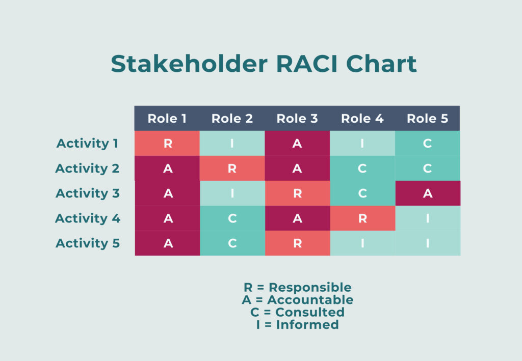
A RACI Chart (Responsibility Assignment Matrix) is useful for outline who does what in a project. It involves creating a simple table with tasks or activities down one side and each role or individual along the top. Then assign one of four letters: R (Responsible), A (Accountable), C (Consulted), or I (Informed) for each person and activity. In the context of stakeholder projects, you could use this diagram to determine who (in a broader stakeholder engagement team) is responsible for taking on specific tasks or engagement activities — and what role the other team members might play in that activity.
Stakeholder Personas
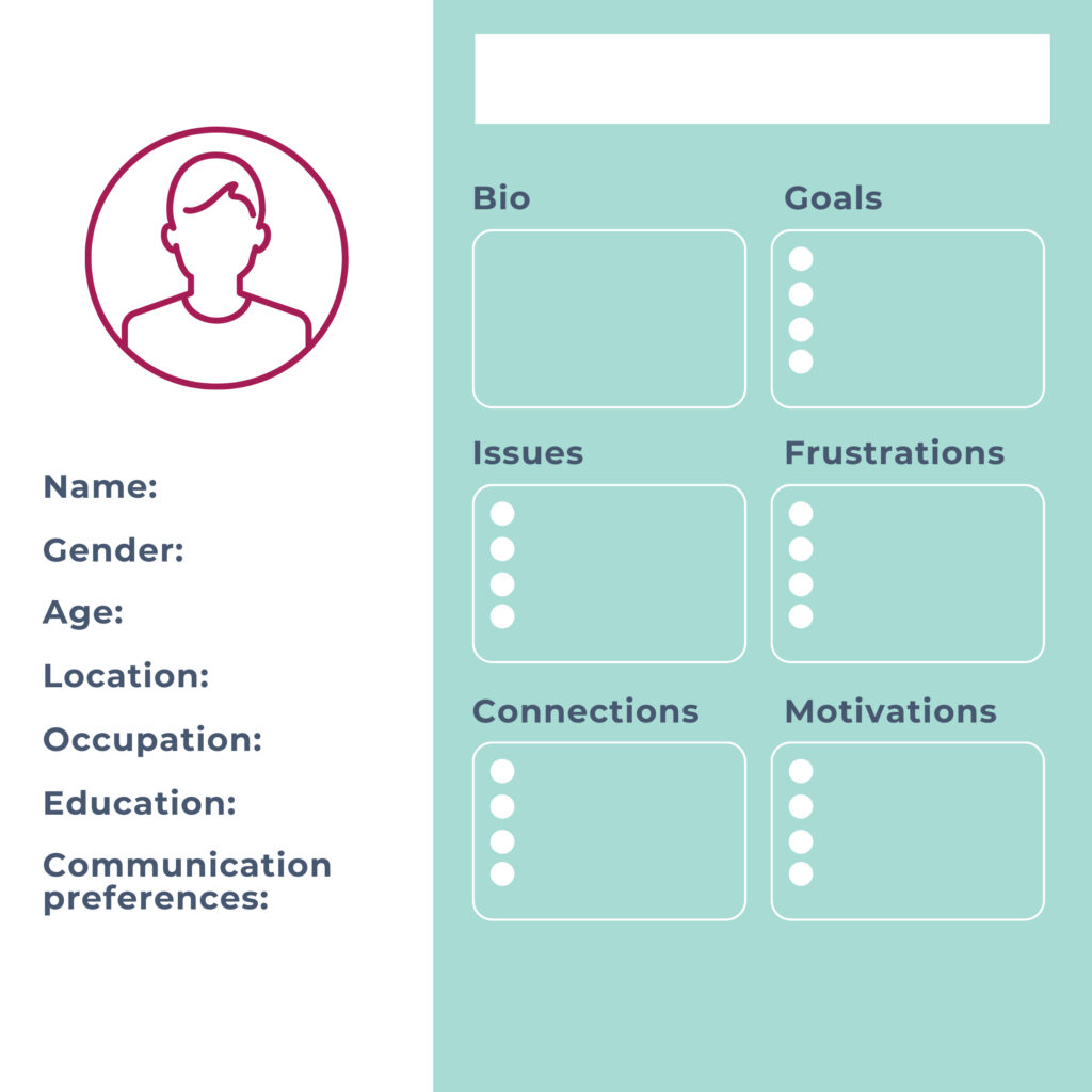
Finally, personas are another type of diagram or framework that can be used in stakeholder projects — though of course, they’re also commonly used in product development, sales, and marketing. But if you need to try to understand a specific stakeholder a little better, they can be a useful tool for displaying qualitative research (that doesn’t fit elsewhere) and putting yourself in their shoes.
Learn More
That concludes our list of stakeholder diagrams! There’s so much out there to choose from, depending on the attributes you want to focus on.
Before we go, remember to put your stakeholder diagrams into action! They’re a really valuable tool for quickly and visually communicating a situation to your team and collaborators. Use your diagrams in planning and reports, but also reference them regularly to influence your stakeholder activities, communications, analyses, and decision-making.
Want to do some further reading on stakeholder mapping and diagrams? Check out our previous blogs on: